All of the recent, and mostly detrimental policy changes and other developments aside (see Related Articles), I’ve found that there seems to be a significant shift with eBay in placing more and more advertising in front of its customers.
Banner and skyscraper ads, sponsored ads and links, promotions, coupons, advertising-based redirection/confirmation pages, “eBay MasterCard”, “Daily Deals”, and more. This “billboardization” of the service begs the question as to the priority of the company – hosting an auction site or generating advertising revenue?
As a user, it can be a challenge to wade through the ad content to actually use the site for its originally intended purpose – participating in auctions. If fact, more and more, it is actually a chore to find the auction content amid the various ads and redirection pages.
The following are a few examples showcasing of the amount of advertising and promotional content a typical user encounters in navigating the website.
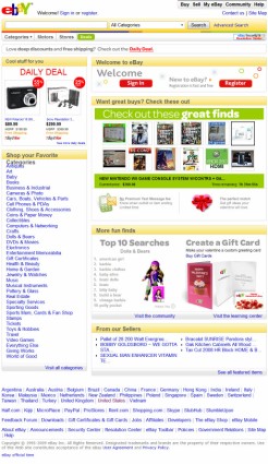
Below is a screen capture of the typical main page one finds in going to eBay.com:
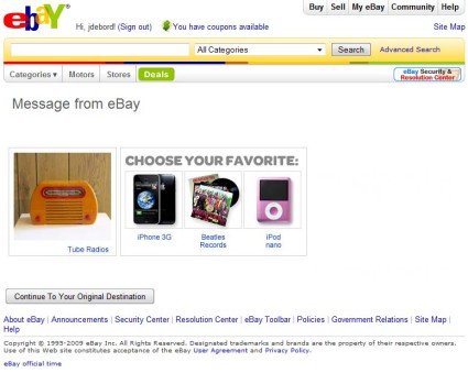
After signing into the site, the following is the typical redirection page displayed prior to reaching the “My eBay” page or other selected destination (even if you click on those links directly, this page is frequently displayed first regardless):
I have probably seen that yellow and orange “Tube Radio” at least 100 times now. It doesn’t seem to matter how many times you bypass that link, the site will feed it back to you, over and over, day after day.
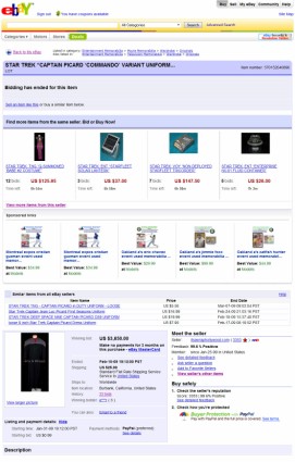
Interestingly, after auctions have ended, going back to review the results users encounter more ads (often two layers worth, many completely unrelated to the type of item sold) at the top of the listing, which you have to scroll past to get to the actual content:
As a user, it becomes increasingly prohibitive (and time consuming) to get to the actual content. There is no way around the ads, apart from scrolling past them or clicking around them.
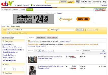
I’ve also found recently, in performing word searches on the site, results are returned even when there are none – eBay will simply remove one of the keywords (in this example, a critical one – “original”):
Again, this is unhelpful, because no result is still a result. Changing your search criteria arbitrarily is likely done to keep the user hooked into the site, but giving you results that don’t match what you searched for is typically a waste of time. From eBay perspective, I would imagine that more “clicks” are to their advantage, in that each click recycles a banner ad, for instance, which is one more impression which can be charged to the advertiser.
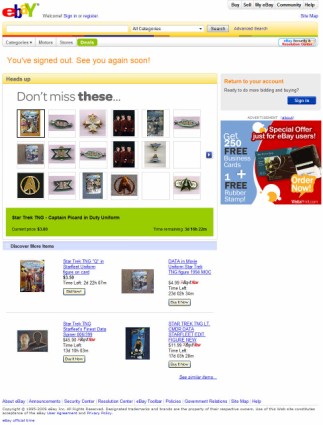
Increasingly, the interface is altered not to optimize the experience for the user, but to create as many advertising impression opportunities as possible.
And, of course, after logging out of your account, you are redirected to yet another page that is a series of advertisements:
This continued emphasis on advertising placement and revenue, coupled with recent shifts to “Buy It Now” and “eBay Store” selling formats, contributes to the erosion of what was once a true auction site into something more closely resembling a flea market version of Amazon.com with lots of ads and a devolving interface. The most significant difference being that Amazon.com provides order fulfillment, customer service, and a host of other options and services, whereas with eBay the success of each transaction and the quality of the merchandise comes down to whichever company or individual you decide to buy from.
Jason De Bord


